
truMedic offers comprehensive solutions for relieving pain and stress through cutting-edge massage therapy, electrotherapy, and similar treatments. The company believes everyone should have access to pain relief and provides products ranging from neck massagers, TENS devices, foot insoles, and more.
To broaden their appeal, truMedic underwent a complete brand overhaul, placing a strong emphasis on both performance and relief. This evolution successfully attracted a younger, fitness-oriented audience.
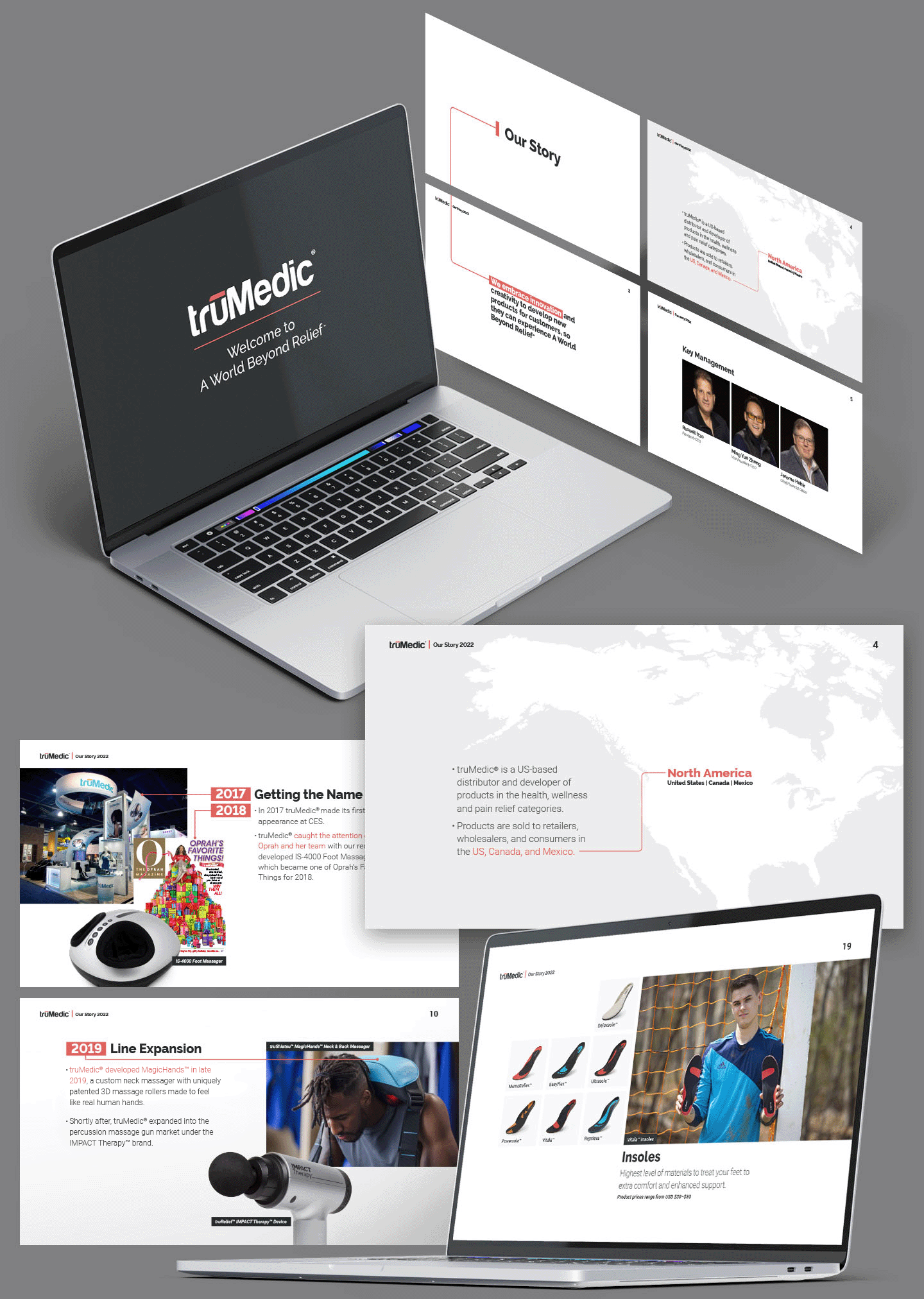
Brand Identity
Editorial Design
Package & Manual Design
Product Photography
Signage


For truMedic to grow in the modern market, they required a fresh visual update to their branding in order to extend their influence beyond a middle-aged and elderly demographic. The focus shifted towards products catering to performance and post-workout pain relief.
This redesign improved legibility and unified the design across multiple marketing channels. Now, truMedic emphasizes power and performance using accents of red to communicate vitality and vigor.
Raleway features a clean, geometric aesthetic that not only emphasizes performance, but its old-style elegance resonates with the middle-aged audience captured by truMedic's original design. Roboto complements Raleway with its clean look and legibility across different formats and marketing channels.
Versatile typefaces were used to meet the demands of truMedic’s international reach, extending beyond the United States into Canada and Mexico. Raleway and Roboto not only maintain a clean and professional appearance in English but also work in Canadian French and Spanish.


truMedic participates in industry events like CES and maintains a strong retail presence in North America, including Costco and Sam's Club.
These displays prioritized large, compelling imagery of the products, accompanied by bold text and informative icons. This design direction ensures that products with less intuitive appearances are presented clearly and engagingly.


truMedic offers a catalog of massage devices, from handheld electrotherapeutic TENS devices to large, reclinable massage chairs.
Every product includes a detailed user manual designed to disseminate information through custom icons, clean illustrations, impactful product photography, and a solid understanding of typography. Designing effective instructional manuals reduces returns and brings a greater understanding of using more complex devices.


The design philosophy for physical displays and product manuals extends into package design with a continued emphasis on bold imagery and descriptive labels that clearly communicate product functionality.


